Cloudstock puts us all into a very challenging situation. At every minute, there are 5,000 awesome developers to speak with, and up to 12 parallel sessions. The bottom line is–if you are from this world–you will miss most of them. So where to go? Here's my list of the sessions I want to be at.
9:30am - 10:15am
Amazon, Google, LinkedIn, mongoDB, force.com, and Engine Yard in the same slot? Oh my. Based on what I know about the cloud apps and infrastructure already, I'd skip Amazon Web Services introduction and Google introduction. There's a lot of online stuff available about mongoDB and force.com, so LinkedIn is my winner.
10:30am - 11:15am
Jakub is talking about GoodData APIs and developer tools in his talk called One Stop Shop for Analytics. I would like to know more about Heroku but I'll go to Introduction to Bulding Apps with Twilio.
11:30am - 12:15am
This is easy, I need to get some enlightenment before the lunch, so Apigee it is: Your API Sucks.
1:15pm - 2:00pm
Apigee one more time? Or Box? Yahoo? This is not decided yet. Most probably Thinking outside the API hosted by Box. Interaction of platforms is something I want to hear about.
2:15pm - 3:00pm
This is very easy. I need to be at BI Platform as a Service because I talk there. Do you want to know what I'll be talking about? Check out my mindmap.
3:15pm - 4:00pm
Another difficult slot: Yahoo, CloudKick, Twilio, and Heroku together. After the whole day in Moscone, I would need some air, and Yahoo's Managing a Cloud: The View from 30,000 Feet will give me exactly that.
As you can see, Cloudstock will make my day. And–I will not be participating in Hackathon. I have no idea how the hackers among us will be able to code and listen to the sessions at the same time.
You can tell me on Monday.

We help you over troubled water
It can be hard to start with a new technology. And it's even harder to start with it and deliver an application in a few days. That's what Cloudstock Hackathon is about. You need to use at least two Cloudstock partners APIs or services, and you need to deliver the application by Monday. See complete rules.
I mean: stop reading, start coding! Time is running fast and you don't want to spend another minute procrastinating. We want the hackathon to be fun, not pain, so we are here to help you. In the end, you have to build your hacking bridge over API water on your own. However, if you want to use GoodData in your app, we are here to help you understand how to work with our APIs and tools.

So start your keyboards now: MacBook, iPads, iPods, Mac Minis, Kindles, and other prices can't wait to be won!
Join our GoodData Developer Network. Start with reading our blog post about Cloudstock Hackathon. You should also follow @gooddata_dev at Twitter.
:. Labels:
Cloudstock

What integration is next? #inext2010
San Francisco goes crazy as the Giants are marching through the city. In the same time, I'm in Austin, Texas, at IntegratioNEXT 2010, Pervasive Integration User Conference.
I like the conference. It's very well organized (thanks, Lori), great people, excellent talks. If you ask people at other conferences, they tell you it's interesting. Here I hear it's useful, and useful is better than just interesting.
I'm here because we've just announced our partnership with Pervasive. With GoodData connector, you can just take the integration stuff you already have and send your data directly to GoodData platform.
Dashboard in 15 minutes? Not a dream. As Pervasive is now completely in the cloud, it's very easy to make your data actionable. It just makes sense. Data as a Service and Platform as a Service fit together. Read more about it at GoodData blog.
The conference is almost over, and some people say I'd better be home, watching the World Series Champions parade. But believe me, this is not the last time the Champions parade is happening in San Francisco. I tell you that.
:. Labels:
conference,
connector,
Giants,
Pervasive
The best dashboard ever
There's hunger for dashboards outside. You can buy books about creating dashboards, you can hire consultants to create dashboards, you can spend a lot of time and a lot of money hunting your dashboard dream. The truth is, the best dashboard is very simple.
The only dashboard that anyone would ever need has three pieces.

At the top, there's a line chart, and the line goes always up. There's no explanation of axis or whatever (you can guess time is running to the right and money is running to the top but who knows and who cares). The only goal of the chart is to make you happy. The line's going up, hurray!
Then there are traffic lights on the left. The light tells you how you're doing. Is it green? Perfect. Is it yellow? Do something. Is it red? It's too late to do anything (however the line's going up, so you have enough time to pack your box and quit the job in a decent way).
Finally, there a text box telling you what to do. If the light is green, it's telling you what to do to keep it green. If the light is yellow, it's telling you what to do to make it green again. (If the light is red, don't waste your time reading the text box, just go, go!)
Now there's more than a joke in this dashboard. A friend of mine who's running a very small business has recently told me that BI tools are useless for her. "I don't need to slice and dice my sales, I don't need to measure how good my campaigns are," she has complained. "I just need to know what to do next."
Her point was clear: It's good to know your sales are decreasing for the last 6 months. And it's better to know that it's all because 85% of your existing customers in South Africa have declined your renewal package. Maybe you knew it without BI, maybe not. However even if it's a new fact for you, it's not telling you how to deal with it, how to fix it.
Davenport, Harris, and Morison are describing it in their recent book Analytics At Work as a shift from information to insight. Fully automated BI tools can help you with information: what happened, what is happening now, and what will happen.
To understand how and why did it happen, what's the next best action, and what's the best/worst that can happen, you need something more. You need people who can make the shift: understand information, and get insight out of it.
These people will create the dashboard discussed above, and it will be the best dashboard ever.
The only dashboard that anyone would ever need has three pieces.

At the top, there's a line chart, and the line goes always up. There's no explanation of axis or whatever (you can guess time is running to the right and money is running to the top but who knows and who cares). The only goal of the chart is to make you happy. The line's going up, hurray!
Then there are traffic lights on the left. The light tells you how you're doing. Is it green? Perfect. Is it yellow? Do something. Is it red? It's too late to do anything (however the line's going up, so you have enough time to pack your box and quit the job in a decent way).
Finally, there a text box telling you what to do. If the light is green, it's telling you what to do to keep it green. If the light is yellow, it's telling you what to do to make it green again. (If the light is red, don't waste your time reading the text box, just go, go!)
Now there's more than a joke in this dashboard. A friend of mine who's running a very small business has recently told me that BI tools are useless for her. "I don't need to slice and dice my sales, I don't need to measure how good my campaigns are," she has complained. "I just need to know what to do next."
Her point was clear: It's good to know your sales are decreasing for the last 6 months. And it's better to know that it's all because 85% of your existing customers in South Africa have declined your renewal package. Maybe you knew it without BI, maybe not. However even if it's a new fact for you, it's not telling you how to deal with it, how to fix it.
Davenport, Harris, and Morison are describing it in their recent book Analytics At Work
To understand how and why did it happen, what's the next best action, and what's the best/worst that can happen, you need something more. You need people who can make the shift: understand information, and get insight out of it.
These people will create the dashboard discussed above, and it will be the best dashboard ever.
:. Labels:
analytics,
Business intelligence,
dashboard
Five excellent excuses why not to be agile
Sure, everybody says: be agile! But what if you don't really feel like being agile? You need some excuses. And here are five excellent ones.
Recently, I've read a book about usability testing, Rocket Surgery Made Easy by Steve Krug. In my opinion, it's not a good book but I like its Chapter 11.
In Chapter 11, Steve Krug describes what designers say when you ask them to change something. And I've realized that it's not about usability testing. It's about agile development, and about life in general.
Here are five excellent, absolutely essential lines. Learn them, use them, and you don't need to be agile again.
How often I have heard these lines!
And you know what, here's a neat trick. Don't keep them just for you. Tell everybody in your company about them. Make them visible, write them down in big letters and post them high so everybody can see them all the time.
And then just wait until somebody says one of them. Enjoy that moment, point at the lines, nod, and say: Chapter 11. You'll be surprised how it works. Because excuses cannot be excellent if everybody knows them.

Recently, I've read a book about usability testing, Rocket Surgery Made Easy
In Chapter 11, Steve Krug describes what designers say when you ask them to change something. And I've realized that it's not about usability testing. It's about agile development, and about life in general.
Here are five excellent, absolutely essential lines. Learn them, use them, and you don't need to be agile again.
- If we're going to fix it, we want to do it right.
- It's a core problem. There's no easy way to fix it.
- That's all going to change soon anyway. We can live with it until then.
- It's going to end up feeling like a kludge.
- We can't fix that right now. We don't have time.
How often I have heard these lines!
And you know what, here's a neat trick. Don't keep them just for you. Tell everybody in your company about them. Make them visible, write them down in big letters and post them high so everybody can see them all the time.
And then just wait until somebody says one of them. Enjoy that moment, point at the lines, nod, and say: Chapter 11. You'll be surprised how it works. Because excuses cannot be excellent if everybody knows them.

:. Labels:
agile
How to create a good funnel chart
It might sound crazy but there are holes in a good funnel chart.
If you've read my previous article, you already know how easy it is to create a funnel chart that is wrong in many ways. And that sometimes it's better to visualize your data in a simple bar chart. However, as my colleague Sam Boonin observes, funnel charts are very popular:
I did a survey during the "track your marketing waterfall" webinar where I asked people to vote on funnel chart vs bar chart, and they all voted for funnel.
Would you believe that? A funnel chart, which is in fact a single stacked bar chart -- the second-worst evil right after pie chart! (Read Stephen Few if you have no idea why.)
Let's look at the funnel chart we've ended with yesterday:

There are 3 opportunities in the Qualification stage, 3 in the Proposal stage, and 3 in the Negotiation stage. Do these numbers (3, 3, and 3) look like the same in the funnel? No, because the chart is funnel shaped, so it looks like the Qualification stage is bigger than Proposal, and much much bigger than Negotiation.
But wait, isn't it true that an opportunity was in the Qualification stage before it went to Proposal? That's a very important mind shift. If opportunities flow from one stage to another, it's not really important where they are today but how they were able to get there and whether they move in the future or not.
Check out the following table:
| in stage | as of today | ever |
|---|---|---|
| Prospecting | 2 | 2 + 17 = 19 |
| Qualification | 3 | 3 + 14 = 17 |
| Proposal | 3 | 3 + 11 = 14 |
| Negotiation | 3 | 3 + 8 = 11 |
| Closed Won | 8 | 8 |
If we start from the bottom, there are eight Closed Won opportunities at the end of our funnel. In Negotiation, there are three opportunities right now, but these eight won opportunities were in Negotiation, at some point in time, so the total is eleven. Fourteen opportunities were even in Proposal: three that are there right now, and eleven that were in Proposal and are in Negotiation or Closed Won. And so on, the funnel starts with 19 opportunities.
If it's simple like that in your business, you're lucky. But most of us have no sales funnel like that. We have a funnel with holes, we have a funnel combined with a colander. That's why the whole funnel metaphor is wrong -- if you pour a glass of water into a real funnel, you get a glass of water coming out of it. If you pour a thousand leads into a sales funnel, you don't get a thousand won deals.
In our example, there are eight opportunities won but also ten opportunities lost and 2 opportunities deferred. And unfortunately, we're not able to fix the table, because we're not sure at what stage was an opportunity moved to Closed Lost. Was it after Negotiation or immediately after Prospecting?
To understand that better, we need to look at opportunities history. To make a good and correct funnel chart, we need to switch from Salesforce.com to GoodData.
Don't take me wrong, you can create a very wrong funnel chart in GoodData, too. Look at this one, created in the Sales Analytics Demo project:

The two Closed stages are so big that the real funnel is almost invisible. So let's fix it, i.e. let's introduce holes into the funnel.
In GoodData, Salesforce.com data are stored in snapshots. You can look at your numbers as of today but you can also look at history: how was my pipeline two months ago, in the beginning of quarter etc. In this case, we will look at all the snapshots at once and ask a simple question: How many opportunities were ever in these stages?
We need to create a metric to answer such a question. This is the first one. It counts all opportunities that were ever in our funnel:

The next one starts with the second stage:

I guess you already know why we include all the stages. Let's explain it on the third metric:

One would say that to get the number of opportunities that were ever in stage Cultivate, it's enough to include this stage in the metric definition, and skip the tail of the funnel. That is true in an optimal world where opportunities are not beasts and sales reps are not lazy to track everything.
For example, there might be an opportunity that was won without entering the Cultivate stage. Or maybe it was in fact in Cultivate but nobody has changed the stage in Salesforce.com. Maybe it skipped Cultivate and went immediately to Proposal. In all these cases, we want to count this opportunity to the Cultivate stage of our funnel, because it would be there in the optimal world.
What is the difference between the first and the third metric? Here we have the holes. The third metric doesn't count the opportunities that left the funnel in the first two stages. If an opportunity was in Prospect and then closed as Lost, it's not there. If it was in Prospect, and then Qualify, and then Lost, it's not there.
Stage is a checking point, and you measure how many opportunities were able to get there. That's what a funnel is for and what a funnel chart should visualize.
I guess you can imagine how the other four metrics look like. Drum roll, here's a good funnel chart.

It's a holistic overview of your historical pipeline, your successes, and -- your holes. 4,192 opportunities are at the top of the funnel, and because it's part-funnel, part-colander, only 2,893 of them are at the bottom. As you go down, the numbers are getting thiner and thiner. The shape of the chart is not funny anymore, it has a meaning.
So now you have your funnel chart. Time to get these holes fixed.
:. Labels:
chart,
funnel,
salesforce
It's easy to create a wrong funnel chart
Let's try to create a funnel of opportunities that are moving through stages, from Prospecting to Closed (either Won or Lost). If something is moving along a defined way, it might be useful to display that as a funnel. So how many opportunities do we have in each stage?
To create such a funnel chart in Salesforce.com, you just need to select Opportunity Stage field as "Segment" and Record Count as "Value". You get something like this chart:

Why is it wrong? The funnel suggests the stage order. Each opportunity should start in Prospecting stage, and then it is moved to Qualification stage, Proposal etc. But look at the last two stages: Closed Lost and Deferred. It's definitely not what you want -- Closed Lost is not the next stage after Closed Won. Deferred and Closed Lost are stages that don't belong to this funnel chart.
To do that, you need to exclude these two stages in Advanced Filters:
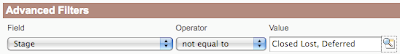
Now it's better:
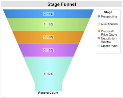
Better but still wrong. The opportunities in the first four stages are really floating, they're moving or they are at least expected to be moved. On the other hand, Closed Won is the final stage (the positive one), and it's not a part of your pipeline. It's the bucket where your opportunities should end, not the funnel itself.
If you keep it like this, opportunities in Closed Won stage will take the biggest part of your chart because these are opportunities that were ever won. Other stages shows opportunities as of today. You might have thousands and thousands won opportunities, and only a hundred of opportunities in your pipeline, and that ruins your funnel chart.
So back to the filters, again.
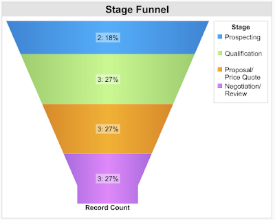
Is this funnel chart correct? Well, not really. Salesforce.com help says:
Funnel charts are useful for showing the flow of opportunities through the stages; a substantially larger segment may indicate a bottle-neck at that stage.
So if this is what are funnel charts for, do we have a bottle-neck in any stage? I guess no but is funnel chart the best chart type to find that out? In fact, it's just a stacked bar chart, funny shaped, yes, but stacked bar chart. Let's convert the funnel chart to plain bar chart:
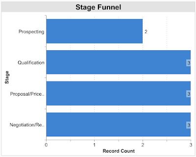
Now I'm pretty sure, there's no bottle-neck. So are funnel charts bad? They're not but most of them are wrong, simply because it's easy to create a wrong one.
How to create a good one? Here's a hint: Go to your kitchen and check your real funnel. Pour water into it. Does it ring a bell? If not, come tomorrow. I'll write about it.
:. Labels:
chart,
funnel,
salesforce
Subscribe to:
Posts (Atom)