
Let's try to create a funnel of opportunities that are moving through stages, from Prospecting to Closed (either Won or Lost). If something is moving along a defined way, it might be useful to display that as a funnel. So how many opportunities do we have in each stage?
To create such a funnel chart in Salesforce.com, you just need to select Opportunity Stage field as "Segment" and Record Count as "Value". You get something like this chart:

Why is it wrong? The funnel suggests the stage order. Each opportunity should start in Prospecting stage, and then it is moved to Qualification stage, Proposal etc. But look at the last two stages: Closed Lost and Deferred. It's definitely not what you want -- Closed Lost is not the next stage after Closed Won. Deferred and Closed Lost are stages that don't belong to this funnel chart.
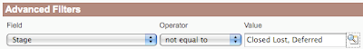
To do that, you need to exclude these two stages in Advanced Filters:
Now it's better:
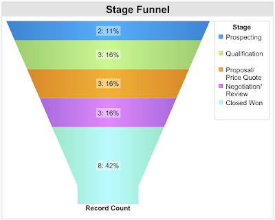
Better but still wrong. The opportunities in the first four stages are really floating, they're moving or they are at least expected to be moved. On the other hand, Closed Won is the final stage (the positive one), and it's not a part of your pipeline. It's the bucket where your opportunities should end, not the funnel itself.
If you keep it like this, opportunities in Closed Won stage will take the biggest part of your chart because these are opportunities that were ever won. Other stages shows opportunities as of today. You might have thousands and thousands won opportunities, and only a hundred of opportunities in your pipeline, and that ruins your funnel chart.
So back to the filters, again.
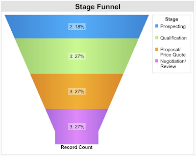
Is this funnel chart correct? Well, not really. Salesforce.com help says:
Funnel charts are useful for showing the flow of opportunities through the stages; a substantially larger segment may indicate a bottle-neck at that stage.
So if this is what are funnel charts for, do we have a bottle-neck in any stage? I guess no but is funnel chart the best chart type to find that out? In fact, it's just a stacked bar chart, funny shaped, yes, but stacked bar chart. Let's convert the funnel chart to plain bar chart:
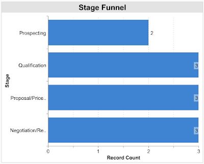
Now I'm pretty sure, there's no bottle-neck. So are funnel charts bad? They're not but most of them are wrong, simply because it's easy to create a wrong one.
How to create a good one? Here's a hint: Go to your kitchen and check your real funnel. Pour water into it. Does it ring a bell? If not, come tomorrow. I'll write about it.
No comments:
Post a Comment